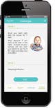
3) "Add" buttong should be circle scale image. That circle image is same as in gmail inbox for android.
4) Challenges: Placing of an image feels weird, there so much spac wasted around it.
May be images should be rectangulare? Also text should have some sections, in the example it would be "Why" section.
"Brush you teeth right after the dinner for 7 days" is header. There could be "Examples" or "How" sections.
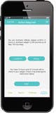
5) Action Required (let's rename tab to Actions): It feels like iOS app. Usually apps on Android follow material design,
i.e. boxes and different layers of boxes.
8 yıl önce
Yarışma Sahibi
8 yıl önce
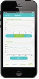
Design is clean, I like general color and fonts. But it looks like it was designed for iOS.
1) In Android tabs are usually at top and you swipe left/right t change tabs.
2) I really like that you are emphasizing active goal. We could make it so that it shows a little more
information for the active goal: time progress and weight loss progress. So it will be quick summary of the current goal.
There should not be check-box for active goal. I like that completed goals a de-emphasize, users should look them much rarely.
Also all goals a clickable (if clicked user is taken to more details about the goal),
so there should be some affordance.