Smart and PLDT
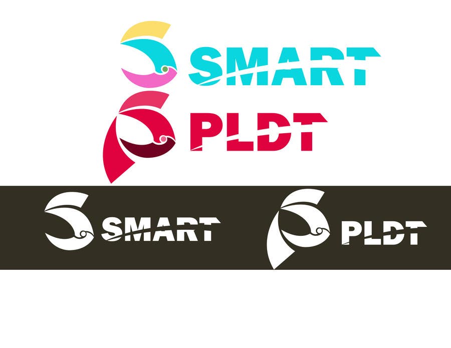
FIRST OF ALL, AS A SMART USER , I DID NOT MAKE MY LOGO MOSTLY COMPOSED OF A CIRCLE AS A WHOLE.WHY? BECAUSE I THINK THAT CIRCLE IS A TRADEMARK OF GLOBE THAT MOST OF THE CONTESTANTS DID. SO I DID WAS A LOGO THAT ARE SIMILAR TO THEIR CORRESPONDING FIRST LETTERS, S and P. The Smart logo: The YELLOW element symbolizes their TECHNOLOGY to go with the advancement that is globally competitive quality of service. The BLUE element symbolizes their CUSTOMERS ,that's why it is the biggest element of my logo because their customers is their priority. AND BLUE MEANS TRUST. The MAGENTA element symbolizes their PEOPLE that SUPPORTS us, their customers. As you can see, it supports the biggest element in the logo And the GREEN CIRCLE represents the CONNECTION between the customers and its people. The PLDT logo:It is the same as Smart's element symbolizes but the last element, It symbolizes the SUPPORT AND PARTNERSHIP of PLDT to Smart. THANKS


