Board Game needs a logo to use on our site, cards, and shirts. **We give clear instructions and great feedback**
- Durum: Closed
- Ödül: $150
- Alınan Girdiler: 3
- Kazanan: StefanMoisac

Yarışma Özeti
Thanks for looking. This should be fun and allow for creativity for you while still giving you an idea of the type of result we want. There will be plenty of banner ad work for the winner if they want it.
The logo should:
- Have easy to read text.
- Text to use:
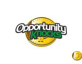
Opportunity Knocks
- Use the same font, weight, color, treatment, filters, and/or style for all the words in the logo.
- It should work in black/white or black/grey too for our print needs.
- The words ARE the logo. Don't add any other graphics or icons to go with the words. However, you MAY encapsulate the entire words within a graphical element.
- Good examples include oDesk and Upwork logos.
Things we know we like:
- The ideas of financial wisdom (considering time, money, family, education, opportunity cost) are core to the game.
- Clean design. (keep the graphics simple).
- The URL is the game name: OpportunityKnocksGame.com
- The contest is for a logo only.
- The logo style and use is intended for both a board game, card game, and a digital screen game.
- The final product must be provided both as a layered PSD file and an AI or EPS version.
- The logo will be used on branding efforts (lots of banner ads), on the game, and on the website itself.
- This is (of course) work for hire under US law. All rights to the work are given to us, the buyer, should we award you, the designer, the
contest and Freelancer complete the award payment for this contest. You may (of course) still show the logo and/or reference our URL as part of
your portfolio if you wish.
Thank you guys very much, and we're looking forward to the designs.
*****See Attached Logo Designs for examples (good and bad)*****
Aranan Beceriler
İşveren Geribildirimi
“Professional, communicated clearly and was very responsive and prompt. Also demonstrated patience when we stumbled due to oversight during handoff. Highly recommend.”
![]() completethings, United States.
completethings, United States.
Genel Açıklama Panosu
Yarışmalara nasıl başlanır
-

Yarışmanızı İlan Edin Hızlı ve kolay
-

Tonlarca Girdi Alın Bütün dünyadan
-

En iyi girdiyi seçin Dosyaları indirin - Kolay!