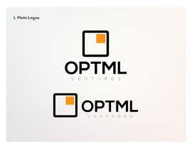
Create a logo for a new marketing/technology company

  • Durum: Closed
  • Ödül: $100
  • Alınan Girdiler: 102
  • Kazanan: juanmikes

Yarışma Özeti

Hi! We are a new marketing/technology company called Optml (pronounced like "optimal"). We are in the business of creating solutions to improve modern living and human performance.

We need a logo/unique mark that represents being "optimal" - it needs to be contemporary, clean, and simple, while balancing looking technical/scientific with feeling friendly and approachable. Fitness 2.0. Think clean, flat design with no more than 2-3 colors. Inspired by (but don't copy!) logos like Nike, Sonos, FedEx, BP, Target - we've included an image with a few examples of logos we like.

We are looking for a typographic logo and unique mark, which must work both horizontally (mark to left of text) and within a square bounding box (i.e., mark on top of text). Logo must work on both dark (black, muted) and bright (white, orange) backgrounds. You are welcome to try out different capitalization treatments (all caps, all lower, etc.). Please note we are not fans of serif fonts :) And please do not alter the "O" in our name to be a different shape like a ball of fire, spiral, etc.

Lastly, below the logo should also appear (in much smaller text, possible using a secondary color) the word "Ventures", which can be easily removed without affecting the mark.

Thanks, and looking forward to seeing your concepts!

Aranan Beceriler

İşveren Geribildirimi

“@juanmikes won the contest on 21 March 2014”

Profil Görüntüsü optml, United States.

Genel Açıklama Panosu

  • fluidxcreations
    fluidxcreations
    • 10 yıl önce

    check #150

    • 10 yıl önce
  • mahisahrifahmed
    mahisahrifahmed
    • 10 yıl önce

    Please also check #149 Thanks

    • 10 yıl önce
  • mahisahrifahmed
    mahisahrifahmed
    • 10 yıl önce

    Sir! Kindly check my entry #148

    • 10 yıl önce
  • goianalexandru
    goianalexandru
    • 10 yıl önce

    Please check my entries sir.

    Thank you!

    • 10 yıl önce
  • optml
    Yarışma Sahibi
    • 10 yıl önce

    Hi! Thanks again for all of your submissions. Some of you are still asking for feedback on the logo marks - here's our advice. Imagine you saw a t-shirt with your logo on it. Would you wear it based on how it looks, even without knowing what the company does?

    • 10 yıl önce
  • JAKUM
    JAKUM
    • 10 yıl önce

    Hello, please can you write me a private message?

    • 10 yıl önce
    1. JAKUM
      JAKUM
      • 10 yıl önce

      tell me please what do you want to change on my top rated logo. ill create for you free business cards like a gift. Thanks

      • 10 yıl önce
    2. optml
      Yarışma Sahibi
      • 10 yıl önce

      Please read the comments we left below your submissions. Mainly, we are looking for a mark that doesn't overpower the logo, and can work both standalone, as well as to the left of the text (horizontal) and above the text (as if it were contained in a square-shaped bounding box). The current mark still feels a bit too health/wellness vs. some of the other submissions we received. Thanks!

      • 10 yıl önce
  • Emanuella13
    Emanuella13
    • 10 yıl önce

    please check #101 ....thanks

    • 10 yıl önce
  • janith67
    janith67
    • 10 yıl önce

    please check #94 (rate and feedback please) Thanks

    • 10 yıl önce
  • janith67
    janith67
    • 10 yıl önce

    please check #93 (rate and feedback please) Thanks

    • 10 yıl önce
  • janith67
    janith67
    • 10 yıl önce

    please check #92 (rate and feedback please) Thanks

    • 10 yıl önce
  • janith67
    janith67
    • 10 yıl önce

    please check #91 (rate and feedback please) Thanks

    • 10 yıl önce
  • optml
    Yarışma Sahibi
    • 10 yıl önce

    Thanks everyone for your submissions so far! Some good ideas so far, but just want to clarify a few things. 1) Please don't alter the text of our name in any way (i.e., turning the "O" into a flaming ball, bulls-eye, etc. 2) Many of you are including very generic marks that could represent anything - we want something that represents us (one idea we came up with internally was to create a variation on a chart like this, which shows an "optimal" curve - Perhaps something based on overlayed charts that show one as being "optimal", like http://gnuplot.sourceforge.net/demo/transparent.2.png (but please don't copy this exactly!). 3) We are seeing a lot of the same font families being used - we are not looking for something sci-fi or Star Trek! Please review the logo samples we included in our brief. Thanks!

    • 10 yıl önce
  • optml
    Yarışma Sahibi
    • 10 yıl önce

    Hi everyone, thanks for the submissions so far! We are working to review and get feedback to all of you as quickly as possible. Please re-read our brief, as we've clarified a few additional items and included some examples of logos we admire.

    • 10 yıl önce
  • JAKUM
    JAKUM
    • 10 yıl önce

    Hello, check #19 #20 (rate and feedback please) Thanks

    • 10 yıl önce

Daha fazla yorum göster

Yarışmalara nasıl başlanır

  • Projenizi ilan edin

    Yarışmanızı İlan Edin Hızlı ve kolay

  • Tonlarca girdi alın

    Tonlarca Girdi Alın Bütün dünyadan

  • En iyi girdiyi seçin

    En iyi girdiyi seçin Dosyaları indirin - Kolay!

Şimdi bir Yarışma İlan Et ya da Bugün Bize Katılın!