Design a Website Mockup for RoomFinder
- Durum: Closed
- Ödül: £140
- Alınan Girdiler: 9
- Kazanan: niloynil445

Yarışma Özeti
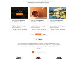
Take a look at AirBnB.com I dont think their design for a "find a room to rent" is intuitive. They have nice little video clips which gives a nice feel, but it is too arty. When you come to a website to find a room to rent, you want to make some quick choices, right? 1) Quickly pick how many bedrooms you need. Maybe secondary choice for bed type: double, single, plus cot, etc. 2) Where you want the room; country, area, road even? There must be lots of easy graphical ways to pick a place, now that Google has opened up mapping. What about a map with pins showing the location of the places that have been filtered for the facilities you picked in 1).
Maybe different coloured pins for the price range?
Maybe an adjustable radius on the map so you see if there are your requirements nearby?
Sure you will want pictures of the rooms and the building they are in, and the area, but maybe they should be pop up as thumb nails when you hover over a pin? or be a scrollable deck of thumbnail pictures, of all the rooms in the map radius chosen? And the arty feely pictures as a background?
Think about the process of looking for a room to rent, what order you do it in, people do it differently maybe so a design that can let all types pick the way they want?
Maybe some will pull together a short list?
Dont forget this will be viewed on TVs, PCs, laptops, tablets, kindles and smart phones, so screen size will change.
When youve found the room, what will you do next, book and pay? Need a fast compact design, easy to understand. Think you can come up with a good design?
Aranan Beceriler
İşveren Geribildirimi
“Great work, glad of the contribution to our body of work.”
![]() wellsurecorp, United Kingdom.
wellsurecorp, United Kingdom.
Genel Açıklama Panosu

Yarışmalara nasıl başlanır
-

Yarışmanızı İlan Edin Hızlı ve kolay
-

Tonlarca Girdi Alın Bütün dünyadan
-

En iyi girdiyi seçin Dosyaları indirin - Kolay!