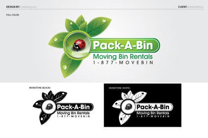
Logo Design for our new startup-up company Pack-A-Bin.
- Durum: Closed
- Ödül: $290
- Alınan Girdiler: 92
- Kazanan: creativegurus

Yarışma Özeti
Pack-A-Bin rents out eco-friendly plastic moving bins to families and companies that are moving. Instead of using cardboard boxes that only can be used 2-3 times and then end up at the landfill, we want families and companies to rent our plastic eco-frien
Aranan Beceriler
Genel Açıklama Panosu
-

zarishize
- 11 yıl önce
congrates @creativegurus
- 11 yıl önce
-

creativegurus
- 11 yıl önce
Thanks @ zarishize
- 11 yıl önce
-

lastmimzy
- 11 yıl önce
Congrats @creativegurus
- 11 yıl önce
-
creativegurus
- 11 yıl önce
thank you @lastmimzy
- 11 yıl önce
-

YouEndSeek
- 11 yıl önce
please check my entries, thank you!
- 11 yıl önce
-
lastmimzy
- 11 yıl önce
Wow such a luck it will be if the @ejgraphics win the contest!!! Only the first contest and win from the first time with 2 entries There is great talent in America ups in Canada ........very cleverly :)))
- 11 yıl önce
1 mesaj daha görüntüle
-

contender44
- 11 yıl önce
@lastmimzy you mean to say that it's a Fake contest ? !
- 11 yıl önce
-
lastmimzy
- 11 yıl önce
I say what I think everyone can make conclusions :) I hope it`is coincidence, but I already report two similar cases.....:(((
- 11 yıl önce
-
creativegurus
- 11 yıl önce
#133, thanks
- 11 yıl önce
-
lastmimzy
- 11 yıl önce
#118 and #119 my last entries
- 11 yıl önce
-

RenderVirtua
- 11 yıl önce
please rate my new submissions
- 11 yıl önce
-
lastmimzy
- 11 yıl önce
and #114
- 11 yıl önce
-
lastmimzy
- 11 yıl önce
#112
- 11 yıl önce
-
lastmimzy
- 11 yıl önce
#105 #106 #107 Pls Check ! I hope you like it :)
- 11 yıl önce
-

hammad143
- 11 yıl önce
#103, #104
- 11 yıl önce
-

ipanfreelance
- 11 yıl önce
#96 > Simple :)
- 11 yıl önce
-

mtuan0111
- 11 yıl önce
Hi wimbeekhuis.
Help me check #82 , #83 , #84 .
Thanks you.- 11 yıl önce
-

dim1970gr
- 11 yıl önce
A feedback please for #81
- 11 yıl önce
-

GreenAndWhite
- 11 yıl önce
comment please on #66 and #68 . thank you
- 11 yıl önce
-

spgian
- 11 yıl önce
- 11 yıl önce
-
RenderVirtua
- 11 yıl önce
please check #74 and #75, bit changes done
- 11 yıl önce
-
saqibthe007
- 11 yıl önce
#57 .. kindly review entirely new stuff. Cool, elegant, simple, easy to use in black and white.
- 11 yıl önce
-

armpogart
- 11 yıl önce
- 11 yıl önce
-
RenderVirtua
- 11 yıl önce
please check #50 , i like to create Perspective Drawings i hope you may like it.
- 11 yıl önce
-

BennyFortman
- 11 yıl önce
Kindly review #34 . A 3D logo ready for 3D animation - your web content will stand out with this style of logo. Regards.
- 11 yıl önce
-
BennyFortman
- 11 yıl önce
Almost all the major brands employ 3D rendered logos apposed to 2d vector graphics. All the major news channels use 3D for their motion graphics and logo's - 2D elements are actually quite rare on mainstream television. The vector art submitted for this project are well done and imaginative, but unfortunately none of them really say " This is a serious company ". I'll try to produce another sample by the end of the contest for you. Regards.
- 11 yıl önce
-

Habitus
- 11 yıl önce
particularly well the logo would look like printed in one color and small size (the form or a business card) ;-)
- 11 yıl önce
-
saqibthe007
- 11 yıl önce
#39 #40 .. here u go with the revised version as per your feedback. Illustrator Hi-Res file will also enhance its quality. P is prominent now, and any layman can read it easily. I have also tested it on my brothers :)
- 11 yıl önce
-

marijoing
- 11 yıl önce
Hi!, any feedback on #38 please :)
- 11 yıl önce
-

Yarışma Sahibi - 11 yıl önce
Pictures of the bins we will be renting out, can be found here:
http://www.packabin.ca/index.php/our-bins- 11 yıl önce
-
BennyFortman
- 11 yıl önce
Yes. I modeled and rendered that insect in an hour. I didn't have time to add the black spots as you can see.
- 11 yıl önce
-
Yarışma Sahibi - 11 yıl önce
I have permission to use the photos of the bins in my marketing material.
- 11 yıl önce
-

shooklg
- 11 yıl önce
Could you give me some feedback on #14 so I can design a 5-star logo! Thank you!
- 11 yıl önce
-

katai
- 11 yıl önce
I'm 16 and 15. Can you give me some feedback please.
- 11 yıl önce
-

Grupof5
- 11 yıl önce
#2 , #3 , #4 Please check these out! Thanks for your attention!! Hope you like it!! :):)
- 11 yıl önce
-
Yarışma Sahibi - 11 yıl önce
It is OK but not the best.
- 11 yıl önce
-
Habitus
- 11 yıl önce
Hi! Please check #5. Thanks!
- 11 yıl önce
-
Yarışma Sahibi - 11 yıl önce
Not really what I am looking for.
- 11 yıl önce
-

RobertoValenzi
- 11 yıl önce
kindly check #8 , thank you!
- 11 yıl önce
-
Yarışma Sahibi - 11 yıl önce
Too simple.
- 11 yıl önce
-
saqibthe007
- 11 yıl önce
Buddy please review #25 #26 .. simple, elegant and easy to remember. Can make good impact on the mind of the viewers.
- 11 yıl önce
-
Yarışma Sahibi - 11 yıl önce
I like the colours but it is difficult to read the P as a P. If you don't know the company name, it can be confusing.
- 11 yıl önce
-

dnlwbr
- 11 yıl önce
#28
Let me know if you want me to continue the progression of the logo.
I have an idea that would also incorporate one of the boxes.- 11 yıl önce
-
Yarışma Sahibi - 11 yıl önce
It is simple but pretty good. Incorporating one of the boxes would be a good idea.
- 11 yıl önce
-
armpogart
- 11 yıl önce
Please give feedback for #30 , #31 , #32
- 11 yıl önce
-
Yarışma Sahibi - 11 yıl önce
I like that you incorporated one of the bins in the logo. It was not necessary but it nice. On 31 I like that you incorporated a leave, because we are focusing on eco-friendly.
- 11 yıl önce
-

saman111
- 11 yıl önce
plz seal the contest
- 11 yıl önce
Yarışmalara nasıl başlanır
-

Yarışmanızı İlan Edin Hızlı ve kolay
-

Tonlarca Girdi Alın Bütün dünyadan
-

En iyi girdiyi seçin Dosyaları indirin - Kolay!