Freelancer: mikhailduong
Paylaşın:
Girdiyi Rapor Et

REDesign

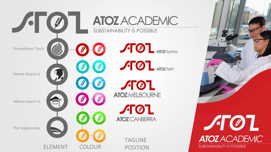
ATOZ Group / ATOZ Education / ATOZ Academic. We suggest some elements in "O", some colors & show you how tagline, sub brand will be locate with the ATOZ logo. SUGGEST: The pencil in "O" is recommended by its simply & impression. The color should be BLUE, RED going with GREY (ex: RMIT University). For future development, taglines & sub-brands are positioned in many ways & suitable for variety promotion materials from vertical flags, standees, posters to digital publications.
%contest_contestName_sub_1% için %entry_number_sub_2% numaralı Yarışma Girdisi

Genel Açıklama Panosu

  • mikhailduong
    mikhailduong
    • 10 yıl önce

    With our experience, we suggest to use these couple of colours: BLUEvsGREY, REDvsGREY. The elements in the "O" should be The PENCIL or "THE LONG JOURNEY" (I don't know which name is most suitable for it, I just draw randomly & feel relax. It's some kind of "HORIZON", "UNLIMITED", "THE HILLTOP". However, I've just realized that It's looked like Mr. Br.OBAMA Logo).

    The design concept is PRACTICAL, ACTION, LIVE like what we try to show with the standee on the right. This style of design is suitable for human-oriented industries like tourism, hospitality, education, healthcare...If you accept, I will support you with 1 years full service: re-edit our designs, provide some sample graphics in social network or even advise your designer with free of charge.

    • 10 yıl önce
    1. mikhailduong
      mikhailduong
      • 10 yıl önce

      Thank you. I missed that message. I am working on it & mailing to you.

      • 10 yıl önce
    2. mikhailduong
      mikhailduong
      • 10 yıl önce

      Please take a look at my porfolio for email address & it's better to work through email. Do you think so ?
      https://www.freelancer.com/u/mikhailduong.html

      • 10 yıl önce
  • AtoZEducation
    Yarışma Sahibi
    • 10 yıl önce

    I prefer the simple and bold "Concept 1" design. The colour red is fine, but I'm wondering - how would the logo look with a standard Windows pointer/cursor instead of the pencil or mortarboard? As the company will offer its services through an online interface, I thought (only just then) that that might be more suitable. Your thoughts?

    • 10 yıl önce
    1. mikhailduong
      mikhailduong
      • 10 yıl önce

      I got your point. I am working with it & will send you via email. Thank you.

      • 10 yıl önce
    2. mikhailduong
      mikhailduong
      • 10 yıl önce

      Please take a look at my porfolio for email address & it's better to work through email. Do you think so ?
      https://www.freelancer.com/u/mikhailduong.html

      • 10 yıl önce
  • AtoZEducation
    Yarışma Sahibi
    • 10 yıl önce

    Also, I don't have a motto for the company (well at this stage anyway), so please provide a design without any motto/catchphrases. And please add the following information in the layout that you feel works best:


    Andrew Hosaka-Zaniewski

    Managing Director


    www.atozeducation.com.au

    Phone: +61 (0) 433-168-944

    Email: andrew@atozeducation.com.au


    If I have left out any other information you require to complete the business card, please let me know and I will get back to you ASAP.

    • 10 yıl önce
    1. mikhailduong
      mikhailduong
      • 10 yıl önce

      Please take a look at my porfolio for email address & it's better to work through email. Do you think so ?
      https://www.freelancer.com/u/mikhailduong.html

      • 10 yıl önce

Daha fazla yorum göster İşleniyor...