Design Icons for Health Care
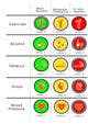
Hello, In these designs I have established the degree of benefit for each level in order of 3 colors: 1. Green = More Benefits 2. Amber = Moderate Frequency 3. Red = Is Less Healthy And for levels I used rings around each icon. 1 Ring = Level 1 2 Rings = Level 2 3 Rings = Level 3 This also is indicated by the number of points in white and black located in the upper vertex of each icon. Each symbol has the same color, the only difference is the background color that can be green, amber or red. It is a simple and neat way to do that is easy to understand. All are designed in PSD so it is easy to edit and change the color. Would love to hear your comments on my design and if you would like any further modification. I hope you like the design. Best Regards