Freelancer: emmlpop
Paylaşın:
Girdiyi Rapor Et

Mashblox

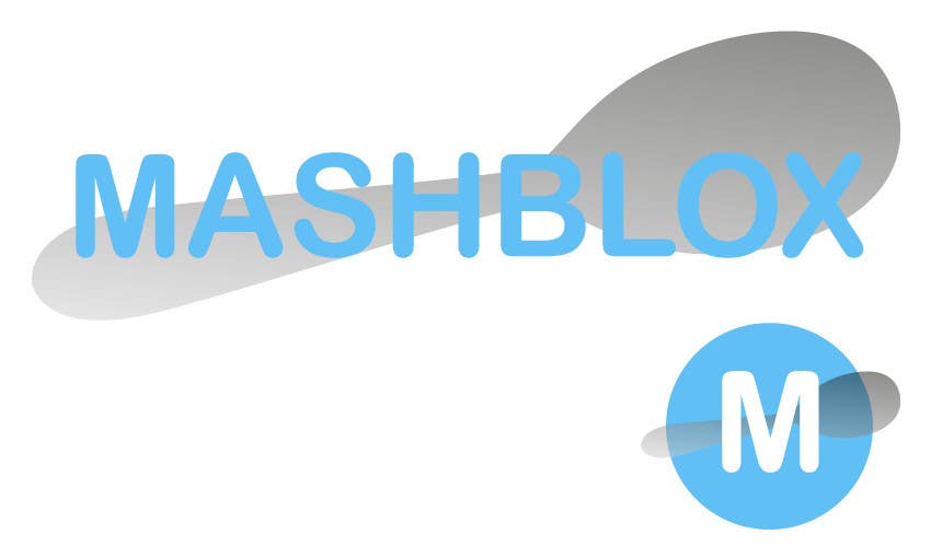
Hi, I have designed a logo and an icon using soft colours, inspired by baby feeding products SMA and Aptamil. I've used a rounded 'friendly' style font, with a very simple symbol of the tilted spoon almost in a folded arms position, to denote having fed the child and got the job done. Both of these can be used on a light or dark background, and optimised either for web or print. Hope you like this, I'm happy to make any amendments for no extra fee. Please leave feedback - thanks!
%contest_contestName_sub_1% için %entry_number_sub_2% numaralı Yarışma Girdisi

Genel Açıklama Panosu

  • Mashblox
    Yarışma Sahibi
    • 7 yıl önce

    Hi Emmlpop, I like the simplicity of this, but I don't think it speaks specifically to the age range, and spoons are effectively a competitor.
    I do love what you've done with your research, and explaining it is great.

    To revise, think more along the lines of Huggies, and Johnson & Johnson - particularly their iconography.

    I've been sharing insights on the product design with the best designers, picture colourful hollow silicon shapes, cubes, rectangular prisms, cylinders etc. I'd love to see this incorporated into the design.

    Cheers,

    • 7 yıl önce