Photo edit Design for surf brand
- Durum: Closed
- Ödül: $90
- Alınan Girdiler: 92
- Kazanan: atmore12002
Genel Açıklama Panosu
-

SaranyaKrish
- 10 yıl önce
Congrats @atmore12002 :-)
- 10 yıl önce
-

gauravbtn
- 10 yıl önce
#79 do you need any edition?
- 10 yıl önce
2 mesaj daha görüntüle
-

nathandrobinson
- 10 yıl önce
I'd appreciate your review of #97 #98 #99 and #100 - thanks so much! I'd love to work with you on this project!
- 10 yıl önce
-
SaranyaKrish
- 10 yıl önce
Please review and provide feedback on entry #88
Hope you like it- 10 yıl önce
-

pcorpuz
- 10 yıl önce
Hi, kindly check #86 . Thanks.
- 10 yıl önce
-

IAN255
- 10 yıl önce
#85 THANK YOU!
- 10 yıl önce
-
IAN255
- 10 yıl önce
Please check and rate #84 thank you!
- 10 yıl önce
-

sherire
- 10 yıl önce
Do you have any suggestions for improving #71 and #75
- 10 yıl önce
-
SaranyaKrish
- 10 yıl önce
#28 was my earlier entry. Had assumed you wanted a logo like design.
Please review and provide feedback on entry #46
Hope it has the T-Shirt print touch that you want- 10 yıl önce
-
Yarışma Sahibi - 10 yıl önce
46 is definitely more on track then 28, thanks you do great work
- 10 yıl önce
-
SaranyaKrish
- 10 yıl önce
Thank you so much for the ratings and comment!
- 10 yıl önce
-
SaranyaKrish
- 10 yıl önce
Please review and provide feedback on entry #56
It is a fishing rod version of entry #46
Hope you like it- 10 yıl önce
-
Yarışma Sahibi - 10 yıl önce
They both look great!
- 10 yıl önce
-
SaranyaKrish
- 10 yıl önce
Thank you so much for the rating and comments!
- 10 yıl önce
-
gauravbtn
- 10 yıl önce
First of all, please let me know whether you want it sketched by charcoal pencil or you want the kind of work i've already posted. Secondly, the lettering was just to show you how it'll look. I have a great idea for the lettering! and do you want anything else with the drawing, i can mould it how much ever you want before starting.
And also if you want the kind of work i've posted, i can do it with better finishing and can add more stuff, and it's editable!
P.S. Sorry for writing it twice, i was not sure which one you'll look at.
Thanks.- 10 yıl önce
-
Yarışma Sahibi - 10 yıl önce
The charcoal pencil may look good. Just know I'm not very familiar with what a charcoal pencil sketch would look like. I like your design a lot! The skull looks great and so does the anchor. I liked the way you wrapped the rope around the anchor also. Otherwise I'm open to any creative ideas you have. Anything that incorporates fishing, the ocean, boating surfing etc..
- 10 yıl önce
-
gauravbtn
- 10 yıl önce
you can view my work at:
https://www.behance.net/gallery/Charcoal/14035301
https://www.facebook.com/GauravAgarwalArt?ref=hl- 10 yıl önce
-
atmore12002
- 10 yıl önce
let me know if this is better #63 thanks
- 10 yıl önce
-
Yarışma Sahibi - 10 yıl önce
Yea it definitely looks better. I'd even say maybe a bit darker or throw in a shade of a different color. otherwise everything looks great
- 10 yıl önce
-
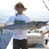
atmore12002
- 10 yıl önce
cool ill play with it. Nice wahoo there. Never caught one but i have been towed around in my kayak by a 25lbs king. There's nothing like being on the water.
- 10 yıl önce
-

richisd
- 10 yıl önce
done...look and tell me what you think tnx
- 10 yıl önce
-
richisd
- 10 yıl önce
pls review and provide feedback #64 #65
- 10 yıl önce
-
Yarışma Sahibi - 10 yıl önce
I still like the background and the skull is better. Id like the bottom of the anchor to show. If you could drop the banner below the bottom of the anchor that would be great.
- 10 yıl önce
-
richisd
- 10 yıl önce
sure no problem I'll do it immediately
- 10 yıl önce
-
richisd
- 10 yıl önce
- 10 yıl önce
-
Yarışma Sahibi - 10 yıl önce
See above reply
- 10 yıl önce
-

igraphicdesigner
- 10 yıl önce
#68. Please feedback
- 10 yıl önce
-
gauravbtn
- 10 yıl önce
Hey,
I am planning on making a charcoal sketch on an A3 paper for you, will that work?
Please revert ASAP so that i get started, as it takes time.
#48 is the idea.
Thank You.- 10 yıl önce
-
gauravbtn
- 10 yıl önce
And also if you want the kind of work i've posted, i can do it with better finishing and can add more stuff, and it's editable!
- 10 yıl önce
-
Yarışma Sahibi - 10 yıl önce
Thanks see my post above.
- 10 yıl önce
-

dumbfished
- 10 yıl önce
Hey again,
Thanks for the feedback!
I was wondering though, even though my entry didn't quite make the cut- would you be opposed to me using it in my portfolio with Loose Anchor still incorporated in.
No obligation, it's more than editable.
Kim- 10 yıl önce
-
Yarışma Sahibi - 10 yıl önce
Id have to say no on leaving the Loose Anchor name in the logo. Im sorry
- 10 yıl önce
-
atmore12002
- 10 yıl önce
thoughts on #61
I thought it looked pretty cool but may not be what you are looking for
thanks- 10 yıl önce
-
Yarışma Sahibi - 10 yıl önce
Wow looks great. You do great work and I will definitely work with you in the future. The only thing I would suggest is to make then anchor darker so it stands out more. But the design is awesome!
- 10 yıl önce
-
atmore12002
- 10 yıl önce
cool. thanks. ill work on the anchor and get it uploaded soon.
- 10 yıl önce
-

alex2927
- 10 yıl önce
Please review #29
- 10 yıl önce
-
Yarışma Sahibi - 10 yıl önce
Its a little too simple and looks kind of like clip art. Looking for more of a graphic design with depth and realistic features.
- 10 yıl önce
-
atmore12002
- 10 yıl önce
update on #32 thanks
- 10 yıl önce
-
Yarışma Sahibi - 10 yıl önce
I like this one but the bandana is a little bright. looks kind of clean for a pirate
- 10 yıl önce
-

parmitu
- 10 yıl önce
Please check entry #33 . Thanks
- 10 yıl önce
-
Yarışma Sahibi - 10 yıl önce
The anchor should be more realistic with shadowing, and the skull bones longer and ends a little smaller. Great skull though
- 10 yıl önce
-

alpzgven
- 10 yıl önce
Any feedback for my designs too maybe?
- 10 yıl önce
-
Yarışma Sahibi - 10 yıl önce
See reply above
- 10 yıl önce
-

LazyGod
- 10 yıl önce
Greetings! Please see #25
- 10 yıl önce
-
LazyGod
- 10 yıl önce
- 10 yıl önce
-
Yarışma Sahibi - 10 yıl önce
I like 38 and 42 a lot. Can you change the color of the skull to a lighter color and different color then the anchor so the two stand out from each other. Maybe the same with the lettering loose anchor so it stands out. Like the font a lot though
- 10 yıl önce
-
richisd
- 10 yıl önce
what u think about #47
- 10 yıl önce
-
Yarışma Sahibi - 10 yıl önce
I like the background a lot. The skull and bones are a little too new school for me. Looking for more realistic artwork. Id preferably like the word anchor to be on the anchor. also Id like the colors to be different with the skull and bones so they can be differentiated. Thanks!
- 10 yıl önce
Yarışmalara nasıl başlanır
-

Yarışmanızı İlan Edin Hızlı ve kolay
-

Tonlarca Girdi Alın Bütün dünyadan
-

En iyi girdiyi seçin Dosyaları indirin - Kolay!