Banner Design for Freelancer.com homepage!
- Durum: Closed
- Ödül: $110
- Alınan Girdiler: 2
- Kazanan: vivekvenu

Yarışma Özeti
Task:
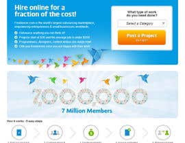
Redesign the '7 Million Users' banner on the homepage of Freelancer.com
Key message:
We just hit 7,000,000 users! Any additional messaging is optional and should only be included if it strengthens the overall effectiveness of your design. (Currently, the banner contains too much text, which reduces the overall effectiveness of the design).
Goal:
Celebrate this major milestone for Freelancer.com with a high-impact banner using effective typography and imagery to reinforce the message.
Dimensions:
Maximum 920px x 255px (can be smaller if it strengthens your design)
Notes:
- Ensure that the new design fits into the existing hierarchy of the homepage
- Consider the existing visual style of Freelancer.com, but don't let that define your own design style
- I want to see a unique design style, not just a recycling of current Freelancer.com design style
- Use your own original image/icon assets or watermarked royalty-free stock photography (do not infringe on copyright laws)
Your banner design could be seen by up to 7 MILLION users worldwide - Make it awesome!
Good luck!
Aranan Beceriler
İşveren Geribildirimi
“@vivekvenu won the contest on 9 April 2013”
![]() craighenneberry, Australia.
craighenneberry, Australia.
Genel Açıklama Panosu
-

pixel11
- 11 yıl önce
Grats vivekvenu!:)
- 11 yıl önce
-

vivekvenu
- 11 yıl önce
Thanks pixel :)
- 11 yıl önce
-
vivekvenu
- 11 yıl önce
Thanks pixel :)
- 11 yıl önce
-

venug381
- 11 yıl önce
M I L L I O N ! not MILION...... ! ?
- 11 yıl önce
-

Yarışma Sahibi - 11 yıl önce
Thanks for your entries everyone. There is some GREAT work in here! I'll make a decision within 24hrs. Thanks for your patience, Craig
- 11 yıl önce
-
Yarışma Sahibi - 11 yıl önce
Hi Everyone, I\'ve extended this contest to allow for revisions and new submissions. Good luck! Craig
- 11 yıl önce
-

nigiiqbal
- 11 yıl önce
plz provide feedback #28 and #100
- 11 yıl önce
-
Yarışma Sahibi - 11 yıl önce
Thanks for your entries! #100 is looking interesting! I really like the design treatment for the \'7,000,000\' graphic, but the font for \'we just hit\' and \'users\' is a bit off-brand. Also, the orange, green and yellow bubbles clouds are off-brand too. I hope that helps! Thanks, Craig
- 11 yıl önce
-
nigiiqbal
- 11 yıl önce
Thank ur response would really help me in other projects. No worries ta
- 11 yıl önce
-

MJBenitez
- 11 yıl önce
I just entered #112
- 11 yıl önce
-
Yarışma Sahibi - 11 yıl önce
Hi There, thanks for your entry. However it doesn\'t fit within the existing brand style. The \'7,000,000\' graphic feels like a button which is incorrect and the Freelancer bird looks too different to our existing logo treatments. I hope this helps. Thanks!
- 11 yıl önce
-
venug381
- 11 yıl önce
Please check #83, #84 Thank you
- 11 yıl önce
-
Yarışma Sahibi - 11 yıl önce
I PM\'d you. Thanks
- 11 yıl önce
-

Scorpire
- 11 yıl önce
Please look @ #97, #98 Thank you.
- 11 yıl önce
-
Yarışma Sahibi - 11 yıl önce
I PM\'d you. Thanks!
- 11 yıl önce
-

dirak696
- 11 yıl önce
hi please check #110 ;)
- 11 yıl önce
-
Yarışma Sahibi - 11 yıl önce
I PM\'d you. Thanks!
- 11 yıl önce
-
MonsterGraphics
- 11 yıl önce
Dear CH, Please Check #106 and #107 Thanks !
- 11 yıl önce
-
Yarışma Sahibi - 11 yıl önce
Thanks for your entries. I like your ideas however there appears to be too many design elements in your banners. This reduces the overall impact of your banner. Eg/ There is: the 5 star ribbon, glossy text with a drop shadow, a world globe that doesn\'t really look like a world globe anymore because it\'s cropped into the bottom right corner of the banner, a big bright star-burst and a Freelancer bird... That\'s about 5 design elements that are all competing with each other and reducing the overall impact. I hope that helps.
- 11 yıl önce
-

prijatel
- 11 yıl önce
I have uploaded my initial design #48 few days ago, no feedback recived???
Feedback would help in directing further upadtes.- 11 yıl önce
-
Yarışma Sahibi - 11 yıl önce
Thanks for your entry. I like your idea however I think the crowd of people in your banner is clashing with the flock of birds in the banner above it. Also, the text treatment is a little flat and uninspiring. I hope this helps. Thanks
- 11 yıl önce
-
Yarışma Sahibi - 11 yıl önce
Thanks for your entries everyone! I\'m seeing a LOT of blue colour palettes in the proposed banners. This is good because it\'s inline with the existing Freelancer.com brand but I\'d also like to see varying colour treatments. We need to find a balance between using complimentary colours and colours that cut through the sea of blue.
- 11 yıl önce
-
Scorpire
- 11 yıl önce
Hello, Please give me your thoughts on #56 & #57 Thank you.
- 11 yıl önce
-
arifsehar
- 11 yıl önce
Hello, sir please check my entry #54
- 11 yıl önce
-
iGyuri
- 11 yıl önce
I uploaded my new cleanest version. (#44)
- 11 yıl önce
-
nigiiqbal
- 11 yıl önce
plz provide feedback #28
- 11 yıl önce
-

design4pro
- 11 yıl önce
Hi,
I uploaded my designs. #25 , #26 , #27 ............Please give your suggestions about these designs.
Thank You.........Hope good Feedback........- 11 yıl önce
-
Scorpire
- 11 yıl önce
Please check and rate #23 & #24 I also left a private message. Let me know. Thank you.
- 11 yıl önce
-
Yarışma Sahibi - 11 yıl önce
Hi Everyone, the contest is still wide-open! Keep the entries coming. I've provided individual feedback to everyone (check your private messages). Looking forward to seeing more submissions! Thanks Craig
- 11 yıl önce
-
iGyuri
- 11 yıl önce
#19 What your honest opinion? What needs to be modify?
- 11 yıl önce
-

ubelievewedo
- 11 yıl önce
please check design #18
thanks- 11 yıl önce
-

cromasolutions
- 11 yıl önce
plz check our entry #7 #8 #9 #10, and give us your feedback plz
- 11 yıl önce
Yarışmalara nasıl başlanır
-

Yarışmanızı İlan Edin Hızlı ve kolay
-

Tonlarca Girdi Alın Bütün dünyadan
-

En iyi girdiyi seçin Dosyaları indirin - Kolay!