Design a Logo for Parabuilding non profit llc
- Durum: Closed
- Ödül: $124
- Alınan Girdiler: 85
- Kazanan: Dewieq

Yarışma Özeti
Logo design to encompass the mission of Parabuilding "Helping folks help themselves through grassroots" and "cocreating heaven on earth"
We are a colorado-based organization supporting efforts related to:
-community
-culture
-consciousness
We want a logo that includes the name "Parabuilding" with some kind of emblem/icon that we can use on our promo materials.In the past we had a tropical island (paradise) motif, but we want to move toward something more universal since we work a lot locally in Colorado.
We want you to be creative, but like motifs such as: roots, the sun, people holding hands, music, mountains, yin yang etc.. This should be contained within a shape-- see the attached rough draft.
Aranan Beceriler
İşveren Geribildirimi
“Dewieq has A+ Graphic Art skills & communication to provide what we (the client) needs & wants. I would recommend Dewieq to any friends & family looking for affordable high quality Graphic design! +Alx http://www.Parabuilding.org”
![]() n2thelite, United States.
n2thelite, United States.
Genel Açıklama Panosu
-

KiVii
- 10 yıl önce
please check #95
- 10 yıl önce
-

alkalifi
- 10 yıl önce
#81 #80 #82 design is very similar to this, please check --->>>
http://www.google.com/imgres?start=548&client=firefox-a&rls=org.mozilla:id:official&biw=1366&bih=606&tbm=isch&tbnid=UMYsTL2xaxqrIM:&imgrefurl=http://www.jimkukral.com/2012/07/building-a-brand-from-nothing-sproutar-com/&docid=WpkPgMz-Vy7PyM&imgurl=http://www.jimkukral.com/wp-content/uploads/2012/07/Sproutar-%2525E2%252580%252593-Grow-Your-Business-Online-%2525E2%252580%252593-Internet-Marketing-Services.jpg&w=395&h=345&ei=NkIBUpHQMZDIrQfkzIDoAw&zoom=1&ved=1t:3588,r:49,s:500,i:151&iact=rc&page=28&tbnh=195&tbnw=223&ndsp=18&tx=164&ty=124- 10 yıl önce
-

shanmthomas
- 10 yıl önce
for #84 - I made it less crowded
- 10 yıl önce
-
alkalifi
- 10 yıl önce
Your design is very similar to this, please check ----->>>
http://www.google.com/imgres?start=548&client=firefox-a&rls=org.mozilla:id:official&biw=1366&bih=606&tbm=isch&tbnid=UMYsTL2xaxqrIM:&imgrefurl=http://www.jimkukral.com/2012/07/building-a-brand-from-nothing-sproutar-com/&docid=WpkPgMz-Vy7PyM&imgurl=http://www.jimkukral.com/wp-content/uploads/2012/07/Sproutar-%2525E2%252580%252593-Grow-Your-Business-Online-%2525E2%252580%252593-Internet-Marketing-Services.jpg&w=395&h=345&ei=NkIBUpHQMZDIrQfkzIDoAw&zoom=1&ved=1t:3588,r:49,s:500,i:151&iact=rc&page=28&tbnh=195&tbnw=223&ndsp=18&tx=164&ty=124- 10 yıl önce
-
Yarışma Sahibi - 10 yıl önce
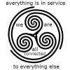
We added 3 new images to the brief "star", "circles" and "reciprocity foundation" ~ what they all demonstrate is simplicity in branding. Can someone give us a simple shape that symbolizes our mission?
- 10 yıl önce
1 mesaj daha görüntüle
-

zapanzajelo
- 10 yıl önce
Kindly check my revised entry #65 :) thank you.
- 10 yıl önce
-

manuelc65
- 10 yıl önce
Bueno desde que pediste logo me tiene confundido
1 primero que tuviera manos
2 raíces
3 un sol
4montañas
5musica
6 genta cogidos de la mano
7 que fueran geométricos
Ahora veo que los logos que más te gusta no cumplen con lo que pides- 10 yıl önce
-
KiVii
- 10 yıl önce
- 10 yıl önce
-
jisjoe
- 10 yıl önce
Respected Sir, Please give a feedback on #54 #55 #56.. Thank You..
- 10 yıl önce
-

EssTechnologies
- 10 yıl önce
Please let us know your valuable feedback on...#47...thank you.
- 10 yıl önce
-
jisjoe
- 10 yıl önce
Respected Sir, Please give a feedback on #46.. Thank You..
- 10 yıl önce
-
Yarışma Sahibi - 10 yıl önce
the contest has been extended 3 more days... I like what im seeing so far and will have more feedback for yall tomorrow! thx, +Alx O*8^)~
- 10 yıl önce
-

mariusfechete
- 10 yıl önce
What do you think about #38 ?
- 10 yıl önce
-
zapanzajelo
- 10 yıl önce
Please check #44 thanks! :)
- 10 yıl önce
-
KiVii
- 10 yıl önce
- 10 yıl önce
-
shanmthomas
- 10 yıl önce
i have one more if you want me to send it to you separately
- 10 yıl önce
-
KiVii
- 10 yıl önce
- 10 yıl önce
-
Yarışma Sahibi - 10 yıl önce
We really like sacred geometry, and want something more symbolic than an illustration.
- 10 yıl önce
-
PopaVladDesign
- 10 yıl önce
Check #12 and tell me what to modify if you are not satisfied! (private)
- 10 yıl önce
-
Yarışma Sahibi - 10 yıl önce
Parabuilding is ONE word-- do not separate it into two!
- 10 yıl önce
-
Yarışma Sahibi - 10 yıl önce
#1 could be a bit more clear and perhaps have the roots of the trees or tree tops spelling Parabuilding which is all 1 word. # 1 could have also have better detail ~ so it's logo ~ the people look like shadows and there are no mountains. # 2 is cute and more professional but needs mountains, sun, friends together etc.
- 10 yıl önce
-
manuelc65
- 10 yıl önce
si no te gusta el logo puedes desirme que es lo que quieres este se basa el borrador que envias
- 10 yıl önce
-
KiVii
- 10 yıl önce
#4 please check
- 10 yıl önce
-
Yarışma Sahibi - 10 yıl önce
the nature simple logo on attached files is simple easy and could be used as a silhouette as well as a logo. music/culture, conciousness & community could be some how creatively put in to this sample logo... thanks!
- 10 yıl önce
-
PopaVladDesign
- 10 yıl önce
Check #2 and tell me what to modify if you are not satisfied! (private)
- 10 yıl önce
Yarışmalara nasıl başlanır
-

Yarışmanızı İlan Edin Hızlı ve kolay
-

Tonlarca Girdi Alın Bütün dünyadan
-

En iyi girdiyi seçin Dosyaları indirin - Kolay!