Freelancer: marcvento12
Paylaşın:
Girdiyi Rapor Et

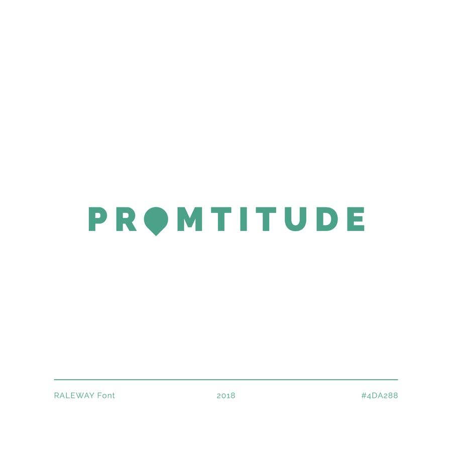
Promtitude, readapting.

As you can see, sometimes readapting doesn't just mean changing the words NEED THIS NOW for PROMTITUDE and leaving the same font. I really like to explain every movement in my artworks, and how do they flow. In this case the meaning it's very simple. It's also a font-based logo, with a customised icon in the "O". Keeping that blue, yes, because it's a color that fits in your service. Elegant, professional and as a service for all ages it fits deliciously. I repeat, every touch on my branding works is thought and rethought to get to the client. Marc, Spain.
%contest_contestName_sub_1% için %entry_number_sub_2% numaralı Yarışma Girdisi

Genel Açıklama Panosu

  • marcvento12
    marcvento12
    • 6 yıl önce

    Hey contest holder, if you're reading this I just would to talk with you in the direct message to explain you that most of the logos that others freelancers are posting (Not all) are copied from google, which you can track down easily. IF you have some time I'll show you, don't want my entry chosen but I cannot let some non-original design win.

    • 6 yıl önce
  • yourdesigns
    yourdesigns
    • 6 yıl önce

    Please, do not copy entry #10 in this same contest. Thank you!

    • 6 yıl önce
    1. marcvento12
      marcvento12
      • 6 yıl önce

      Hey there, thanks for commenting on my entry. Probably, as you have seen, this entry was posted about the same time as #10 . You can also see the third entry, in which there is the first design I did with an incorrect name. I usually do my design without copying and even not inspiring so I think i'm not the right person to discuss on this.

      • 6 yıl önce