Genel Açıklama Panosu

  • neveragainunless
    Yarışma Sahibi
    • 7 yıl önce

    You are one of my top 3 designs now, looking forward to your improvements!

    • 7 yıl önce
    1. Khandesign11
      Khandesign11
      • 7 yıl önce

      Can you come to chat option? So we can communicate faster. For this go to my entry and click chat icon.

      • 7 yıl önce
    2. Khandesign11
      Khandesign11
      • 7 yıl önce

      Check #81 and #82 please.

      • 7 yıl önce
  • Khandesign11
    Khandesign11
    • 7 yıl önce

    Check #81 and #82 please.

    • 7 yıl önce
  • neveragainunless
    Yarışma Sahibi
    • 7 yıl önce

    You can also provide a version of this image with a drawing of a pearl inserted here before "de"

    • 7 yıl önce
  • neveragainunless
    Yarışma Sahibi
    • 7 yıl önce

    Can try making "de" black to separate it from the rest of the word

    • 7 yıl önce
  • neveragainunless
    Yarışma Sahibi
    • 7 yıl önce

    Make the lines of this part of the body thinner (just like "de" part), to make "S" stand out. Leave "S" as is.

    • 7 yıl önce
  • neveragainunless
    Yarışma Sahibi
    • 7 yıl önce

    Make the lines that form "de" thinner so it stands out a bit from the rest of the word.

    • 7 yıl önce
  • neveragainunless
    Yarışma Sahibi
    • 7 yıl önce

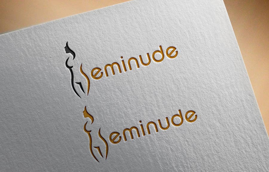
    I like this, and colors look good. Neat simple and elegant. If you would like to make it better, 2 things:
    1. Letter S may get lost when image is in one color. So may make sense to make it stand out a little bit more. One idea of how you could do this is by making the lines of the rest of the body a little bit thinner and leaving the S as is.
    2. I would be curious to see if you have any idea for separating "de" from the rest of the word. Because my URL is "seminu.de" I want to play with this fact and mimic this in the logo a bit. But the logo should not look like a URL, this is important. Some options here:
    - You can do it with color (make "de" black, just like the body, when the rest of the letters are gold).
    - For single color image you can make "de" letters thinner than the rest, not as bold. Maybe similar to how you will change the lines of the body to be thinner.
    - Alternatively you can add an image of a round pearl between "seminu" and "de", to separate them a bit.

    • 7 yıl önce

Daha fazla yorum göster İşleniyor...