
elliskenanroper
United States


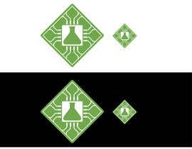
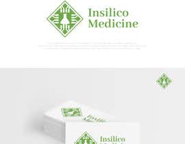
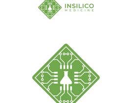
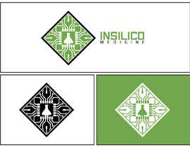
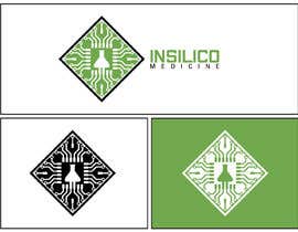
Our partner has a logo (attached). We would like to propose a cleaner version of this logo while retaining the style. The semiconductor must be simplified while retaining most of the same features. The company is making medicine in a semiconductor microchip.
The logo is already well recognized and the modifications need to be made only to make it more visually appealing and easier to remember.
The text part needs to go to the right and should be done using a normal bold font.
Text does not really matter. What really matters is the semiconductor image.
IMPORTANT:
NOTE THE 4* CONCEPTS - THEY ARE SIMPLE (FAR FROM PERFECT, BUT SIMPLE).
Important notes:
1. The shape needs to be retained.
2. The glassware in the microchip need to be retained.
3. The microchip with glassware need to be highlighted in a very simple, clean and impressive manner
4. No gradients.
5. Green + white - the only two colors to be used


Yarışmanızı İlan Edin Hızlı ve kolay

Tonlarca Girdi Alın Bütün dünyadan

En iyi girdiyi seçin Dosyaları indirin - Kolay!