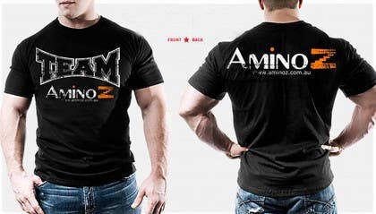
T-shirt Design for Amino Z
- Durum: Closed
- Ödül: $240
- Alınan Girdiler: 79
- Kazanan: coprophagus

Yarışma Özeti
We sell bodybuilding and weight loss supplements. We are targeted at males aged 18-35 years of age. We 100% Australian owned and sell in Australia only. For more information, visit www.aminoz.com.au
Aranan Beceriler
İşveren Geribildirimi
“sdfsadfafdsasdfadfs”
![]() aminoz, Australia.
aminoz, Australia.
Genel Açıklama Panosu
-
bamz23
- 12 yıl önce
damn..wasnt able to submit more entries...congrats to the winner anyway :)
- 12 yıl önce
-
chaperdad
- 12 yıl önce
please check #61
- 12 yıl önce
-

OldSkull13
- 12 yıl önce
Please check #94 and #96 Thanks
- 12 yıl önce
-
OldSkull13
- 12 yıl önce
New #87 need feedback, thanks
- 12 yıl önce
-

Yarışma Sahibi - 12 yıl önce
shield on the front is too big. Maybe don't distort the logo on the front either. On the back, get rid of the graphic and just keep it simple with "Team" Amino Z and the website address. I think this would look better.
- 12 yıl önce
-
OldSkull13
- 12 yıl önce
please check
- 12 yıl önce
-
OldSkull13
- 12 yıl önce
please check #94 thanks
- 12 yıl önce
-
OldSkull13
- 12 yıl önce
Yo...check mine #79 refreshing than others LOL ... good luck guys
- 12 yıl önce
-
Yarışma Sahibi - 12 yıl önce
I really like that shield! Maybe if you could take away the lightning bolts to simplify it? Take away the other graphic - use the shield as the main focus, maybe on the front. I think that shield could look really good because it's quite simple.
- 12 yıl önce
-
OldSkull13
- 12 yıl önce
Thanks, will edit it now
- 12 yıl önce
-
Medina100
- 12 yıl önce
Hi,
Please check works 81 - 85
Thank you.- 12 yıl önce
-
Yarışma Sahibi - 12 yıl önce
A few hours left. Would love to see some simple designs too. Don't get too creative with graphics here, remember being simple and bold can be highly effective.
- 12 yıl önce
-
bcendet
- 12 yıl önce
please see my simple design at # 86. thanks.
best regards,
bcendet- 12 yıl önce
-

Salbatyku
- 12 yıl önce
- 12 yıl önce
-
Yarışma Sahibi - 12 yıl önce
Front text is simple which is good. Probably a bit too fancy with the orange effects. Back needs our logo combined with "Team". Maybe get rid of the background effects to make the t-shirt a little simpler?
- 12 yıl önce
-

ahammad52003
- 12 yıl önce
#30
#31
#32
hi, please check these and give me feedback.
thanks- 12 yıl önce
4 mesaj daha görüntüle
-
ahammad52003
- 12 yıl önce
#69
hi, please check this and give me feedback.
thanks :)- 12 yıl önce
-
Yarışma Sahibi - 12 yıl önce
I don't really think this would be appealing to wear.
- 12 yıl önce
-
coprophagus
- 12 yıl önce
my last design #76 .. thanxs
- 12 yıl önce
-
coprophagus
- 12 yıl önce
my design is only two colors, white base and orange ... recommended print plastisol or water based paint diluted with a 55-tramaje to feel that is zero, with a few strokes when it is printed ...
thanxs...- 12 yıl önce
-
livestudioplus
- 12 yıl önce
some people aint got no shame!! Coprophagus just got kicked out of a contest that he won with a stolen design!! Contest was from RofakTees - http://www.freelancer.com/contest/3471.html
and the design he stole was the astronaut which was actually made by this guy - http://christopherdippner.com/index/?cat=52
Truly sad..beware designers check the design for copywright material and good luck to you all!- 12 yıl önce
-
coprophagus
- 12 yıl önce
hey, first, you investigate what really happened .. and this fix is already supported by freelancer ... you do not comment when you are ignorant of the facts, ok? So if you have shame.
if you want to justify something, do designs and not with your words- 12 yıl önce
-
coprophagus
- 12 yıl önce
my design #60.. thanxs
- 12 yıl önce
-
Yarışma Sahibi - 12 yıl önce
Great idea. Love how "TEAM" is emphasised on the front, this is very effective. 4 stars for this one. Would love to see a few other variations you may come up with. Nice and simple on the back which is great.
- 12 yıl önce
-
bamz23
- 12 yıl önce
sick! :)
- 12 yıl önce
-

anshdeb
- 12 yıl önce
Please rate #68 :)
Hope its better now ??
thanks- 12 yıl önce
-

gadmouh
- 12 yıl önce
Please give feed back, #63 #64 #65 #66 #67 , thanks
- 12 yıl önce
-

mslestat22
- 12 yıl önce
pls check my new design sir i hope i could help you thanks #59
- 12 yıl önce
-
Yarışma Sahibi - 12 yıl önce
Great concept. Too much on the back, maybe remove the "reshape your body reshape your life". The front graphic looks great in my opinion.
- 12 yıl önce
-
anshdeb
- 12 yıl önce
Please rate #43 .
I have also included the back side...hope you like it :)- 12 yıl önce
-
Yarışma Sahibi - 12 yıl önce
Thanks for this. I think it would be better to reduce the "noise" from all the background colour on the front and back. On the back, try to put more focus on "team" Amino Z. I think all the extra background colour is making the t-shirt too busy and detracting from the logo. Take a look at our site, it's quite simple and we'd like to keep the designs simple too while also being effective.
- 12 yıl önce
-
anshdeb
- 12 yıl önce
yeah...
alright gonna do that and upload it soon...
in my personal opinion no more on the front part would look best...
anyways gonna upload the new version with the back side altered a bit
thanks- 12 yıl önce
-
Yarışma Sahibi - 12 yıl önce
A quick update. We will be holding a 1 day poll for our customers on the top designs. The top voted t-shirt design will be put into production. As a result, we strongly suggest that you use realistic mock-ups so our customers can see what the t-shirts will realistically look like. This will be of great advantage!
- 12 yıl önce
-

lolish22
- 12 yıl önce
HI guys, please check #46 , #48 , #49 and the back of the t-shirt #47 . Thanks!
- 12 yıl önce
-
Yarışma Sahibi - 12 yıl önce
Thanks for the alternative designs. The original one rated more highly I feel was better. Feel free to play around with other idea's too though!
- 12 yıl önce
-
bcendet
- 12 yıl önce
Hi, is this contest should copy the clip art?
- 12 yıl önce
-
Yarışma Sahibi - 12 yıl önce
You can use our logo, but feel free to use whatever graphics you wish for the design.
- 12 yıl önce
-
raamsankar
- 12 yıl önce
Please comment on #55
- 12 yıl önce
-
Yarışma Sahibi - 12 yıl önce
It's a simple design and could be quite catchy, appealing to Aussie patriotism. I like it. Maybe try out an alternative icon. The back of the shirt could contain something about "Team" Amino Z to give that sense of community.
- 12 yıl önce
-
anshdeb
- 12 yıl önce
Please rate #21 and #22 ...
might look a bit similar...but i tried to limit the effects on the 22nd one...
tried to blend the body builder more
i hope i am reaching close to want you want...:)
thanks- 12 yıl önce
-
lolish22
- 12 yıl önce
Hi Guys can I get feedback on #40 , front and back #39 and #41 . Cheers:)
- 12 yıl önce
-
Yarışma Sahibi - 12 yıl önce
I liked #39 . The graphic looks good on this. Would like to see more variations of this just to get a bit extra impact.
- 12 yıl önce
-
TabassumK
- 12 yıl önce
Hey, please check out and rate #38 . This is my first time doing one of these and i probably wont win but i would just like your feedback on how i did. If you did like some aspects of my design but would like me to tweak some things i would be happy to do it.
Thank You and I hope you consider my design.- 12 yıl önce
-
Yarışma Sahibi - 12 yıl önce
It's not quite what we're after. Look at the higher rating designs and you'll have an idea about what we're looking for. Remember it needs to appeal to our target demographic.
- 12 yıl önce
-
gadmouh
- 12 yıl önce
Please check #23 , #24 and #25 , thanks
- 12 yıl önce
-
fineart1
- 12 yıl önce
Hi guys, I found a easy way to make money online by doing 10 minutes survey on net, its really amazing without any hassle... hope you also get benifit from this-
http://Survey-Faq.com?ref=2441471- 12 yıl önce
-
Yarışma Sahibi - 12 yıl önce
#14 - Like the concept here. It's bold, simple and masculine. This is getting to the target demographic more. I like the Team Amino Z on the back, this is well done. The main reservation is on the front. I'd like to see the picture more "rough" looking just to give it a slightly more masculine, rough feel, as opposed to a "cartoon" feel. Also rather than reshape your body reshape your life, I think it would be better to have the website address. Our main goal here is to expose our website URL.
- 12 yıl önce
-
bamz23
- 12 yıl önce
i think ive seen that vetor art on a stock photo site...not sure :/
- 12 yıl önce
Yarışmalara nasıl başlanır
-

Yarışmanızı İlan Edin Hızlı ve kolay
-

Tonlarca Girdi Alın Bütün dünyadan
-

En iyi girdiyi seçin Dosyaları indirin - Kolay!